Search Experience at Shepherd
Streamline the veterinary patient check-in process

What is Shepherd?
Shepherd Veterinary Services is a cloud-based SaaS platform offering B2C solutions for veterinary clinics. As the sole product designer, I led a 2-week sprint to redesign a previously removed search function. I conducted user research, aligned stakeholder goals, and delivered a streamlined search experience that enables veterinarians to quickly access critical patient data like inventory and reminders for things like allergies during urgent moments.
Challenge
To redesign the veterinary patient check-in experience by prioritizing key information in the search function and reducing the number of screens, streamlining the process for efficiency.
Business value: To improve user efficiency and enhance workflow, ultimately supporting better patient care in time-sensitive moments.
How might we simplify the veterinary patient check-in process by prioritizing key information and reducing the number of screens to enhance efficiency?
Research
Conducting Firsthand Research
We conducted interviews.
Conducting Secondhand Research
I gathered field research to gather more information on what motivation and incentive systems exist, and looked into some popular successful examples.
Competitive Analysis
To understand what other similar platforms and services exist, and to see where we could strengthen and add to the stream experience, we weighed in on the different features on each popular platform used by content creators currently.

Competitive Analysis Insights
Streamer-Fan Community
Fans want more ways to engage with streamers both in and out of streams, including activities like quests or collaborative moments that build connection.
Monetization Gaps
There’s an opportunity to expand livestream reward systems, similar to loyalty programs in other industries like restaurants and entertainment services.
Engagement Incentives
Twitch is the only platform with rewards, but they’re limited to in-game moments at specific times, leaving out broader engagement opportunities.
What kind of rewards system is engaging?
When we explored various rewards systems for Matrix we found that game-focused ideas, like gacha mechanics and mystery boxes, have always been engaging and addictive. These concepts, common in both gaming and streaming, created a sense of excitement and anticipation, which we saw as a strong way to boost fan participation.
Identifying the Unique Challenges of Creator and Fans
We conceptualized then conceptualized sections of our product by wireframing.
Architecting
Mapping the creator-fan dynamic clarified motivations on both sides, helping us prioritize features and refine our priorities. It led to a more clearer value exchange—laying a solid foundation for future growth and monetization.
Ideating
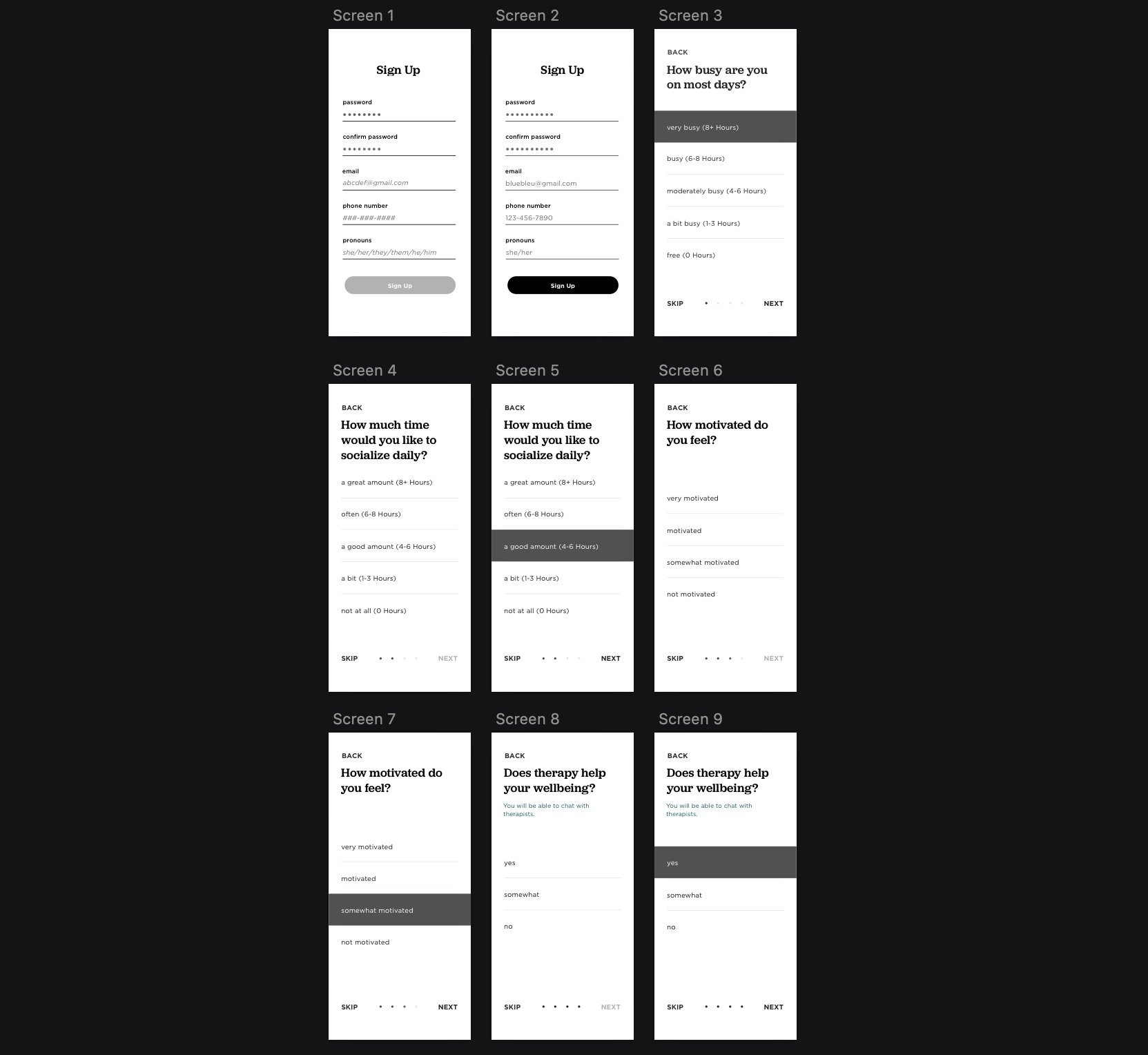
Building on that structure, I created wireframes to visualize the user flow. I focused on communication style and layout choices that would bring a sense of comfort and emotional ease.
Challenges I came across in this were that I realized looking at just the low-fi wireframes and user-testing by walking through prototypes, the level of friendly humanistic conversation still wasn’t at the stage I wanted it to be at, so I changed it. There were also too many questions in the onboarding, which is also a deterrent for users to want to continue. I also tried various shades of blue and landed on a color palette of softer warmer popping blues to feel peaceful, not clinical or dull.
Quests
Users can access fun mental health tips, therapy options, group activities, and edit their profile preferences. A self-care highlight shows untried features, while emergency resources and hotlines are listed at the bottom.

Reward Crafting
Users complete profile creation through friendly, conversational language, avoiding a clinical form-like feel, and can use fun default visuals or upload optional pictures for a more personalized experience.

Creator Pass
Users complete profile creation through friendly, conversational language, avoiding a clinical form-like feel, and can use fun default visuals or upload optional pictures for a more personalized experience.
Reward Inventory & Redemption
Users complete profile creation through friendly, conversational language, avoiding a clinical form-like feel, and can use fun default visuals or upload optional pictures for a more personalized experience.
Takeaways
→ Impact: The System I designed is used to this day
I built Matrix’s reward system that is now live on servers like OPBlocks, BlossomCraft, Manacube, and Vortex with game modes, experiences, and challenges.
→ What I Learned for Next Time
After my work with Matrix, I’d dive deeper into the reward system styles, further define the creator-fan relationship, and prioritize accessibility in design aside from fun graphics. I’d also focus more on user research, testing, and iterating faster. Enhancing communication between creators and fans would be key, along with expanding personalization features.